When analyzing CX data, it helps to change how you want to display your results in an easy manner. We reached out to our customers and asked them what we could do to improve customer experience of the dashboard in order to continue to be successful on our CX platform.
Our CX customers' most wanted list:
- A way to drill down and analyze the dashboard results based on specific questions and profile variables.
- The ability to customize label and use charts their organization is most accustomed to.
- Track changes in responses each month and do month on month comparison.
Their wish is our command! Now you can do all that and more with CX’s dashboard 2.0.
Three new widget features worth knowing about on CX dashboard 2.0
- Customizable widget filters: Users can now filter the data on all of the widgets displayed in the online dashboard in one go. Access global custom variables (customer profile information), and segment and filter the results based on specific questions from the CX survey. This means less time setting up filters for every single widget on the dashboard, and more time analyzing all of the results.
- Customizable chart types and labels: Change the chart types (donut, line, bar, columns, etc.) and choose to show/hide widget labels (x-axis, y-axis, chart-labels, gridlines, etc.).
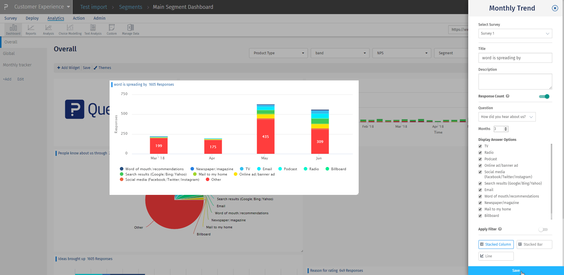
- Monthly tracker widget: Users interested in viewing distribution trends of percentage/responses over specific month range will be able to see the trend of responses received for multi-select/single-select questions. They can select a monthly range to review trending data and select/deselect answer options from the chart.
How to set up customizable filters by custom variables and questions
Set up custom variable filter
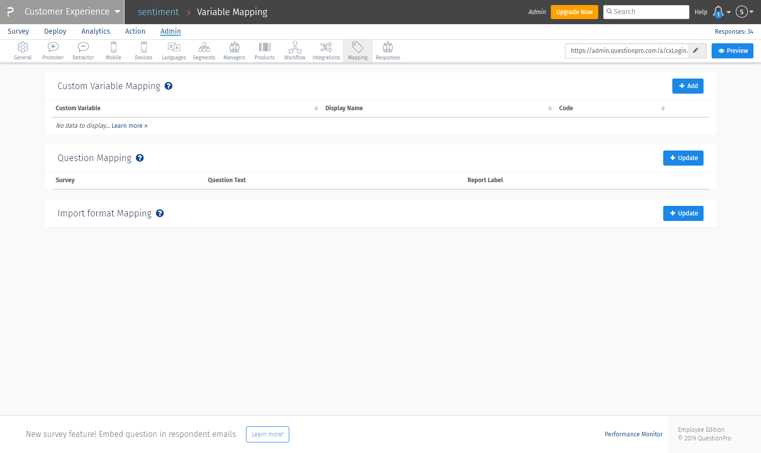
- Login to the CX project and go to Admin>>Mapping
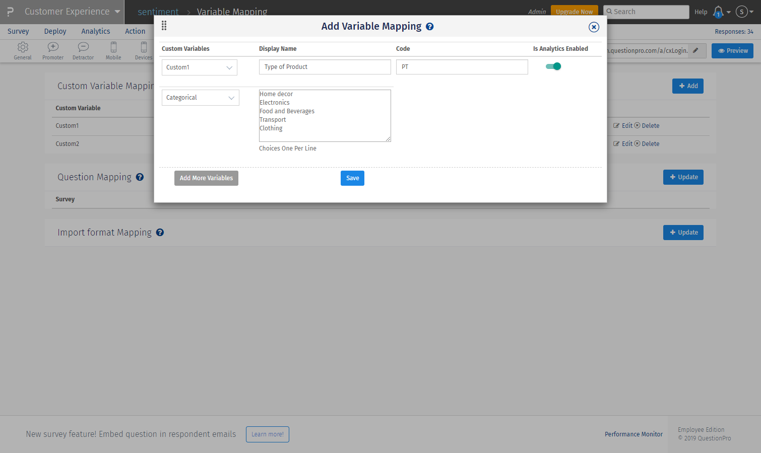
- To the far right of custom variable mapping, click the ‘+add’ button
- Add custom variable number and select the variable type as ‘categorical’ for text values
- Add a display name and mention the values of the custom variable by selecting one per line
- Add code name to reference the variable used (optional)
- Enable the toggle to use as a filter in the dashboard
Set up Question filter
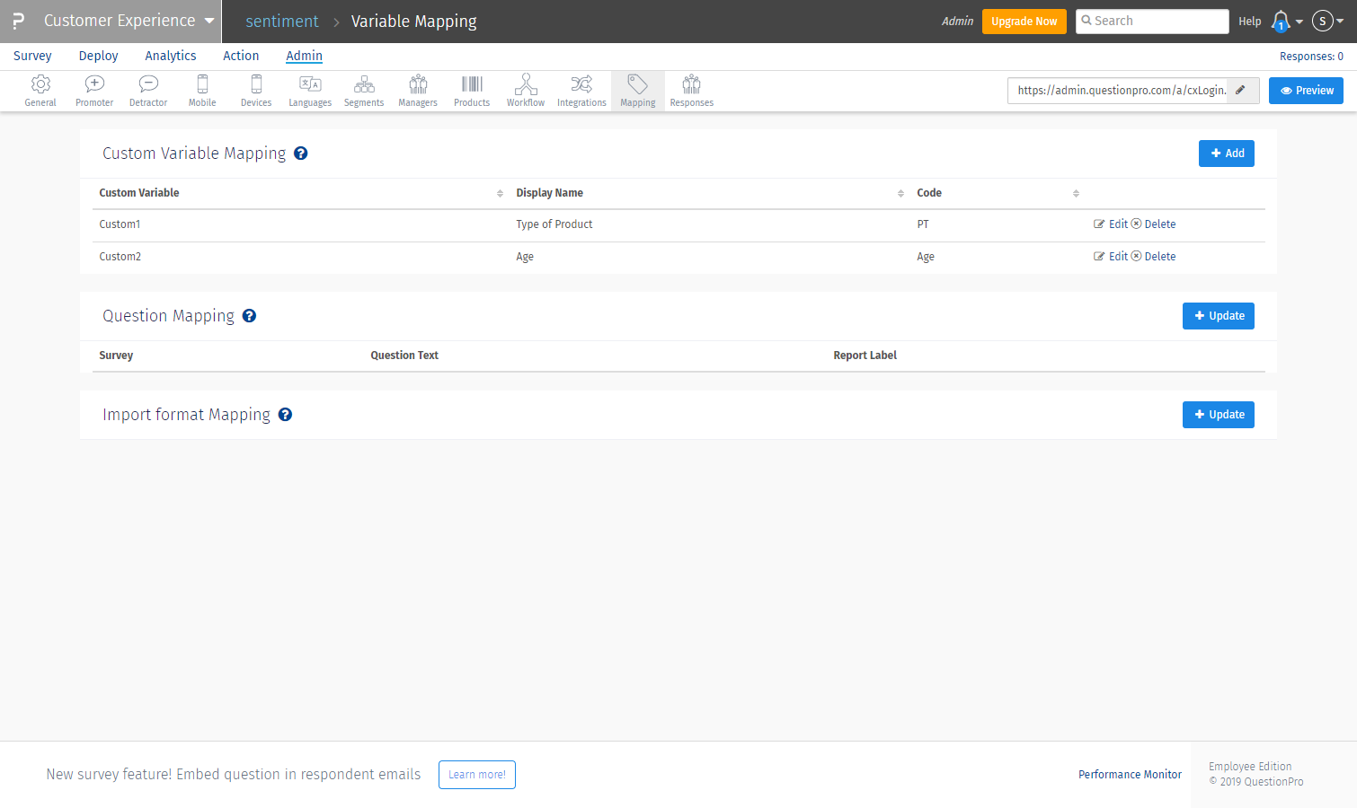
- Login to the CX project and go to Admin >> Mapping
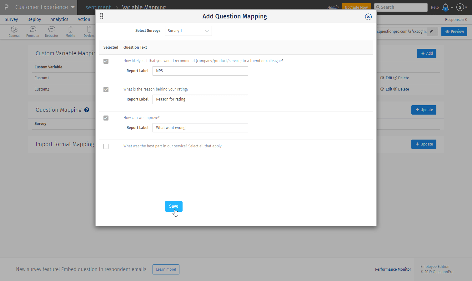
- To the right of Question Mapping, click the ‘Update’ button
-
Select the questions to be added as filters
- Add the text for the filters as the entire question can’t be displayed on a filter
- Click ‘save’
To filter the entire dashboard with the mapped question and product segment variables, go to:
- Admin >> Overall dashboard
- Select the custom variable options, product type, and question you wish to filter the data by and click ‘Apply’ to display in the dashboard.
How to customize chart types and labels on the dashboard
- Go to ‘Edit Dashboard’ to edit widgets.
- Click on the pencil icon to edit any widget within the dashboard.
A settings menu will appear on the overlay with the edit option on the right panel.
Settings that can be edited:
- Title
- Description (will show up on hovering ‘i’ icon)
- Show Response count.
- Chart type – NPS, Donut chart/Line, bar, etc.
- Show/hide tooltip
- Drilldown options: View details or do nothing
- After setting have been selected, click save to display updated widget
How to set up the monthly tracker widget
- Go to Admin >> Monthly tracker>> + add new widget
- Select ‘Survey” >> chose survey as the monthly tracker is a survey level widget
- Add widget name
- Select the monthly tracker thumbnail from charts displayed >> click ‘Next’
- To create the trend, select the question to be tracked and the # number of months to track
- Apply a widget level filter (optional) and click ‘Save’ to display.
Analyzing the monthly tracker
- The X-axis represents responses per answer option by default. You can change it to a percentage from the edit settings
- Y-axis represents months. Default is the current month and two months before the current month as mentioned while setting up.
- Each stack in a bar represents an answer option as mentioned below the chart. The number of responses is displayed on the bar for each answer option.
To learn more about these exciting customizable widget options, contact us today and we can walk you through a live tour of CX dashboard 2.0.
 Survey software
Easy to use and accessible for everyone. Design, send and analyze online surveys.
 Research Suite
A suite of enterprise-grade research tools for market research professionals.
 CX
Experiences change the world. Deliver the best with our CX management software.
 Workforce
Create the best employee experience and act on real-time data from end to end.
